
Every great brand knows that there will always be better ways of doing business. Hence, they find those ways or join the others who have.
In packaging, we've seen cool ideas disappear because better once came into existence. A few years ago, there was Kellogg's cereal tin, but today everyone is talking about white on kraft.
Do you want to grab customer's attention without spending much on design? Do you also want a design that grabs attention? Then, go for the white on kraft trend.
Printing a white ink onto Kraft allows you to work magic with less. The best thing about this type of packaging is your box will always stand out regardless of where they sit.
This is not all its selling points. White on kraft is one way of saying you're committed to using eco-friendly packaging materials. We all know how that is a huge trend these days.
In this article, we are going to tell you more about this new packaging trend. Then, we will discuss the points and benefits we raised above. Also, we will show you how this packaging benefits your business. Keep reading!
What is White on Kraft Packaging?
Think about how your kids use colored markers to make designs on cardboard papers. Now, try to remember how significant these designs were. That's exactly what white on kraft looks like except that it is done with the purpose of selling an idea or a message.
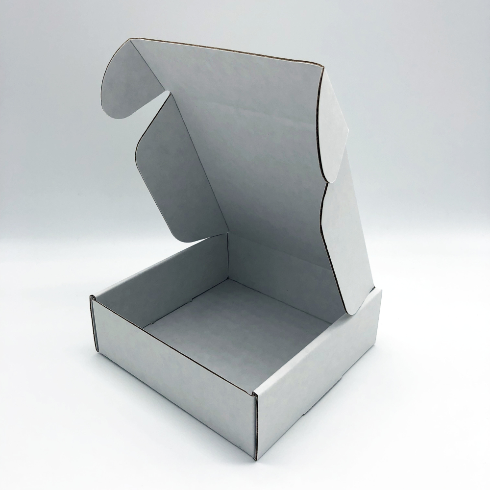
Generally, white on kraft is printing white ink onto Kraft. In packaging, Kraft may be either corrugated boxes or Kraft packing tape. Thus, it means printing your brand's logo, image, or idea on a packaging box.
This packaging trend leverages the uniqueness and clarity that color white adds to any material. Using white on kraft gives a cool, natural, and visually appealing look.
Why White on Kraft?
The global demand for printing paper for 2021 is at 96%. This goes to show that this packaging trend is not going away soon. We also have a guide here, to help you decide between kraft and white boxes.
All over the world, cardboard and paper production totals about 400 metric tonnes. These figures account for production made every year.
We can credit this boom to the rise of online shopping. The United States comes up as the second-highest producer, to match the demand.
In 2018, China led the march by producing 110 million metric tonnes. They went on to dominate the global market by 47%. The United States came close, with 72 million metric tonnes in production.
So, the figures are clear. Printing paper is very beneficial to businesses right now. At this point, you may ask yourself some questions:
- Is this packaging sustainable?
- How do I get on this trend?
- What are the benefits of using white on Kraft packaging?
We are here to answer all your pressing questions. So, here are some things your business will gain from this brand of packaging:
-
White on Kraft is Pro-Green: All over the world, going green is a massive trend. Individuals and businesses are not left out.
Experts predict that the world population will reach 11 billion by the year 2100. This growth will reflect on economies and resource demand.
Yet, in all these, the earth remains the same, with limited resources. With the world’s depleting resources, it is important to make an effort to conserve as much as we can.This is one area this brand of packaging comes in. It is pro-green and vital to the judicious use of earth’s limited resources.
A whopping 75% of Americans care about climate change. Many people are now committed to leaving as little carbon footprint as possible.
A lot have now made the switch to recyclable products. It has also caused a huge switch from white boxes to kraft boxes.
So, there is a target market and demand for this kind of packaging. Your business stands to gain a lot when you make the switch.
-
White on Kraft is A Simple Packaging Design: The kind of packaging you use is a smart investment. Many customers make their decision by looking at your design alone.
They love minimal and simple designs, so you should go for that kind of packaging. This is the edge that white on kraft designs have over other design types.
More people want simpler lives and it shows in everything they do. From minimalist clothing to furniture, and now, branding.
These days, many Tv shows tend to portray simpler lifestyles and diets. Brands have over time, switched up their logos for simpler ones.
You will do your business a whole lot of good if you make this switch too. White on kraft packaging design can help you get that done.
Using a simple, clean design or brand logo on your kraft packaging will go a long way.
It will also make your branding simple and appealing to the eye. This will, in turn, bring the conversion you seek.
-
White on Kraft Packaging Makes The Difference: Your brand packaging is a good way to make a bold statement. It is also an avenue to sell your brand story and connect to customers.
Many people think that their product gives value and so, they need not worry about packaging. This is a false story, like the story of Santa Claus.
You can have a very valuable product, but your packaging must communicate value. Otherwise, customers will pass.
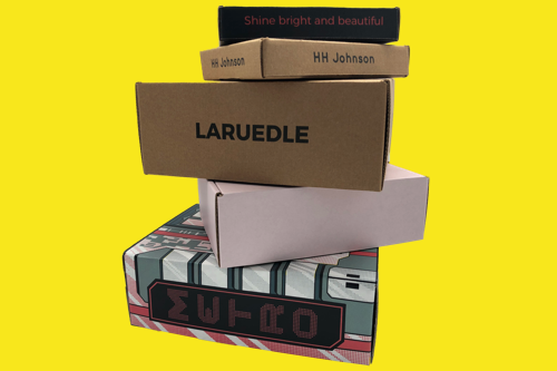
White on kraft packaging is a sure way to make this difference. Many companies use colorful branding to make their products stand out. Most brand logos are either black or in very bright colors.
While this is great, what’s to say that your products won’t get lost in that array of colors? Printing white on kraft paper is not so common.
It is a novel field that will serve the companies that decide to jump on the trend. A simple white branding or logo on your packaging, custom mailer boxes or custom shipping boxes will make a difference.
First, yours will stand apart from all the others. Then, it makes it easy for the customer to remember when they want to order again.
We recommend you speak to experts at Arka to get your white on kraft game on. This will help you get professional advice tailored to suit your specific business needs.
But first, we will show you how to get the most out of white on kraft printing design. So, stay on for the next part of this guide.
Getting The Most Out of The White on Kraft Design
Are you aware that good design is what makes your packaging stand out from the others? If you're just hearing this for the first time, you probably don't understand how packaging works. But the truth is, many people don't. So, don’t panic! Design is the most important thing in white on kraft.
It is what gives life to whatever you intend to achieve with the white ink. You don't want your package box to look like a mistake.
Your white ink will always stand out on kraft, meaning you have to be very careful with what you're doing with it.
We've seen a lot of brands getting it wrong completely. And the truth is, you may also do the same if you don't get this now.
1. Make It Brief and Direct
For any white on kraft practice, the first thing is simplicity. You must learn how to balance the amount of white ink on your corrugated box.
To achieve this, you have to know the right font size to use and how many angles you want to write on.
Even if you have a message on every side of your kraft box, there's really no need to make it all too obvious.
You can use a smaller version of the full message in front of the box. The goal is for your message to be clear enough while remaining subtle.
So, while you might get tempted to play around with designs, don’t. If you can get your message across in fewer words or images, do so.
2. Always Try New Ideas
Most times, great ideas are killed almost immediately they come to mind. If you're thinking of something unique and special, now is the time to try it.
The truth is nobody will really scold you for trying a few of your ideas for white on kraft.
A lot of times, we see white on kraft outside the box. But there are other effective ways to use white ink.
Using this technique on the inside of your box will improve your customer's unboxing experience. You can include a short printed card or note to communicate to your customer.
More so, using white on kraft on the outside and inside at the same time is totally cool. All you have to do is make sure you don't overuse the white ink. Keep it cool, but clear enough.
3. Clarity Is Everything
Before you start printing white on your kraft box, always consider the shade of white that soothes the kraft.
The reason for this is because kraft can also come in different shades of brown. Hence, you need to select the right shade of white for each type of kraft.
There are three shades of white. The first, which is the low density, gives a whitewash look that is great for thick Kraft boxes.
A low-density white will immediately highlight the colors that are important and make them pop up more than the other.
Alternatively, medium-density white is great for sharper graphics. This type of white will help make your logo design stand out.
It features semi-opacity making it easier for individuals to get your message even when they're not close to the box.
High-density white gives full opacity, but it requires a little more expertise than the others. So if you know nothing about colors, we advise that you get someone who does or try something else.
4. Be Flexible
If you want to avoid mistakes on your white on kraft box, try to understand what every box needs. You have to be creative and flexible at the same time.
The truth is, some of your products will not be sold in the same box size or design. It is a rule of thumb in modern business.
Knowing that each box requires at least a different font size or style is important. This will help each kraft box appear natural and original in the end. You can check out how HouseOfRym designed each box here.
5. Reinforce Your Brand's Standard
When you're using white on kraft, always incorporate the traits of your brand values. For instance, if your brand deals on luxurious footwear, you may avoid using a boring white on kraft idea.
The essence is to strike a balance between what your product represents and its packaging.
6. Always Use Full Bleed
Though it's best you go simple with white on your kraft. We don't want to limit what you can achieve.
In printing most marketing materials, it is best to go full bleed. That's printing from one edge of the Kraft box to the other without standard borders.
Conclusion
There are only a few packaging ideas that are very effective. Imagine how easy it is to spot white on any material you see.
Now that's how easy your brand's logo, label, or message will be seen from anywhere in the room.
There's no need to wait any longer. White on Kraft is the new deal in packaging. Your business will gain in many ways when you follow this trend.
This article makes the process easy to understand. We have outlined everything you need to know about white on kraft.
For assistance, we suggest you speak to the professionals at Arka. This will ensure your packaging meets professional and world standards.
Need packaging?