
Packaging 101: The Complete Guide
- Packaging 101
- Types of Packaging
- Aseptic Packaging
- Blister Packaging
- Biodegradable Packaging
- Bulk Packaging
- Carbon Neutral Packaging
- Circular Packaging
- Clamshell Packaging
- Compostable Packaging
- Cornstarch Packaging
- Corrugated Packaging
- Discreet Packaging
- Ecommerce Packaging
- Flexible Packaging
- Frustration Free Packaging
- Retail Packaging
- Secondary Packaging
- Smart Packaging
- Sustainable Packaging
- What is a PR Package?
- What is a Poly Mailer?
- Packaging Design Ideas
- AI Packaging Design
- Bakery Packaging Ideas
- Bath Bomb Packaging Ideas
- Bath Salt Packaging Ideas
- Body Butter Packaging Ideas
- Body Oil Packaging Ideas
- Body Scrub Packaging Ideas
- Brownie Packaging Ideas
- Cake Packaging Ideas
- Cake Pop Packaging Ideas
- Candle Packaging Ideas
- Candy Packaging Ideas
- Canva Packaging Design
- Chocolate Packaging Ideas
- Cinnamon Roll Packaging Ideas
- Clothing Packaging Ideas
- Coaster Packaging Ideas
- Coffee Bag Design Ideas
- Cookie Packaging Ideas
- Cosmetics Packaging Design
- Cotton Candy Packaging Ideas
- Cupcake Packaging Ideas
- DIY Packaging Ideas
- Dog Treat Packaging Ideas
- Food Packaging Ideas
- Empanada Packaging Ideas
- Etsy Packaging Ideas
- French Fries Packaging Ideas
- Frozen Food Packaging Ideas
- Hair Extension Packaging Ideas
- Handbag Packaging Ideas
- Jewelry Packaging Ideas
- Keychain Packaging Ideas
- Lash Packaging Ideas
- Lip Gloss Packaging Ideas
- Macaron Packaging Ideas
- Minimalist Packaging Ideas
- Mug Packaging Ideas
- New Employee Welcome Kit Ideas
- Packaging Colors
- Packaging Inserts Ideas
- Packaging Logo Design
- Packaging Typography
- Perfume Box Design Ideas
- Pizza Box Design Ideas
- Popcorn Packaging Ideas
- Scarf Packaging Ideas
- Skincare Packaging Design Ideas
- Soap Packaging Ideas
- Sock Packaging Ideas
- Sticker Packaging Ideas
- Sunglass Packaging Ideas
- Sustainable Packaging Ideas
- Tea Packaging Ideas
- Wax Melt Packaging Ideas
- Weed Packaging Ideas
- T-Shirt Packaging Ideas
- Wine Packaging Design Ideas
- What is a Packaging Engineer?
- Types of Packaging Materials
- Chipboard vs Cardboard
- Compostable Packaging Materials
- Alternatives to Plastic Packaging
- Edible Packaging Materials
- Food Packaging Materials
- Are Poly Mailers Recyclable?
- How to Recycle Cardboard Boxes
- How to Recycle Packaging Materials
- Medical Device Packaging Materials
- Mono Material Packaging
- Pharmaceutical Packaging Materials
- Plastic Food Packaging
- Protective Packaging Materials
- Reusing Packaging Materials
- Types of Packaging Foam
- Void Fill Packaging
- What is Chipboard?
- What is Kraft Paper?
- Offset vs Digital Printing
- RGB vs CMYK Printing
- Screen Printing vs Digital Printing
- Screen Printing vs Sublimation
- What is a Dieline in Packaging?
- What is Die Cutting?
- What is Digital Printing?
- What is Flexographic Printing?
- What is Glassine Paper?
- What is Offset Printing?
- What is Spot UV Printing?
- Why is 300 DPI Good for Printing?
- How to Estimate Shipping Costs
- How to Pack Glass for Shipping
- How to Mail a Bubble Mailer
- How to Make a Shipping Label
- How To Measure Box Dimensions and Sizes
- How to Ship Alcohol
- How to Ship Artwork
- How to Ship Books
- How to Ship a Cake
- How to Ship Candles
- How to Ship Chocolate
- How to Ship Clothes
- How to Ship Cookies
- How to Ship Food
- How to Ship a Hat
- How to Ship Jewelry
- How to Ship a Laptop
- How to Ship Perfume
- How to Ship a PC
- How to Ship Perishable Food
- How to Ship Plants
- How to Ship Shoes
- How to Ship Vinyl Records
- Packaging Symbols
- Shipping Large Items
- What is a Delivery Exception?
- What is Shipping Insurance?

Meet Kyla Moore, the dynamic project coordinator at Arka, who is driven by her passion for sustainable packaging. She is dedicated to assisting businesses.
Importance of Packaging Typography for Brand Appeal
Some people may need a reason to invest more time and energy in finding the best typography packaging designs. Fortunately, the reasons are pretty strong, and you will probably change your approach toward this branding and promotional tool. Some of the main advantages you can get are:
• Enhances Brand Identity: Improvement of brand identity is one of the ways to expand your business. Packaging typography has the power to help you reach that goal. Fonts and colors of the textual content can directly describe the main values of your brand. By doing that, you will explain to people why you are different from other companies selling the same products. In other words, you will reach a high level of uniqueness and become recognizable among people.
• Captivates Your Audience: Grabbing people’s attention is not as easy as it seems. You may attract them with a design to check out your product. Yet, to hold their interest for a longer period, you have to do more than that. With appropriate typography packaging design, you will convince them to read the textual content on the packaging. That way, you will give them a chance to meet you and ensure a stronger emotional bond with your brand.

Credits: Peter Kortleve, The Dieline
• Influences Customer Choice: It doesn’t really matter which type of product you sell online. There are probably a huge number of competitors offering the same quality and solutions. Your task is to find the best possible way to differentiate your brand from the rest of the world. The appropriate typography can help you become the number one choice among people. Based on packaging content, they will understand that your product is the same, but your brand is different. You will explain to them that, by buying your products, they are actually supporting certain values!
• Creates Hierarchy in Design: Hierarchy in design is a powerful marketing strategy that grabs consumers' attention. Yet, it doesn’t it a bit differently. Most consumers will focus on ingredients and instructions when seeing your packaging. With appropriate packaging typography, you will actually convince them to focus more on brand name and product type. So, how does this work? Well, all the information is divided into four different categories. They look like this:
1. Primary information: Part of textual content where people directly get information about your brand. It is a tool that helps you boost your brand identity.
2. Secondary information: You talk more about the product type here. In addition, you can add the company’s slogan or talk about the number of items placed within the package.
3. Tertiary information: The information you share in the tertiary informative section is related to ingredients, instructions, and similar stuff. These pieces of information are mostly written in smaller letters.
All this information is crucial for different purposes. With appropriate packaging typography design, you can grab customers’ attention and convince them to focus on certain messages you want to send.
• It Makes Packaging Eye-Appealing: The mix of all packaging elements directly influences the look of any packaging type. Typography has the power to boost the design of the entire packaging and make it more interesting. Your only task is to determine which goal you want to achieve. One type of typography is good for luxurious brands, the other for sustainable brands, etc.
20 Tips for Choosing the Right Packaging Typography
Selection of the most suitable packaging typography is challenging. Multiple factors can influence your decision. For instance, it depends on your goals, the messages you want to send, and many other things. That’s why we prepared 20 powerful tips for choosing the best packaging typography. Let’s analyze them one by one!
Consider Your Brand Personality
Brand personality directly impacts the selection of the right packaging typography. That’s why you need to define it before designing your packaging. The typography must resonate with your company’s values and personality. For instance, if you sell luxurious brands, you must pick fonts that give a luxurious sense. Also, they should be colored in gold or silver color.

Credits: Mother Design, Nuud
Legibility is Key
The technical side of printing a particular font and matching designs is probably the toughest task. Whichever fonts you use, ensure that textual content is easily readable under different lighting conditions.

Credits: Meet The Edge
Font Pairing Magic
No one says you need to stick to only one font. On the contrary, more of them on the same packaging may be a perfect match. That especially counts when we talk about hierarchy in design. One font can be used for more important pieces of information, while the other one can be used for less crucial ones. Ensure that those fonts are visually matchable!

Credits: Design Move
Limit The Variety
In addition to the previous tip; it is crucial not to “overdo it”. We do understand your desire to use a variety of matching fonts. Yet, 2 or 3 of them are going to be enough. More of them could harm the overall packaging design and make it look less professional.

Credits: The Office Of Ordinary Things
Prioritize Readability
We previously mentioned that readability is one of the key factors you should focus on. However, we want to give an even stronger tip. Readability should be prioritized! It is completely fine to sacrifice (if necessary) something else. The level of readability must remain high! The messages you send with textual content are those that create an emotional bond between you and your customers. Don’t underestimate it!

Credits: Wong Ting Yue
Balance Hierarchy and Simplicity
We completely support your effort to use packaging typography to ensure the hierarchy in the design. Yet, don’t make it too complex for the customers! For example, as we said, primary and secondary information should be strongly highlighted. Yet, that doesn’t mean the tertiary information should not be visible on the packaging. Properly dedicate each empty space on the packaging for all these pieces of information.

Credits: Mother Design, Nuud
Harness The Power of Colors
The packages you use should contain colors present on your brand’s logo. Yet, no one says that the color must be another shade of the same color. Different packaging colors express different emotions. After defining the goals you want to achieve with packaging typography, determine the right color for the emotions you want to share. Do you want people to associate your brand with safety, health, or love maybe?

Credits: Marx Design Ltd
Optimize for Different Sizes
People selling only one product in the same packaging won’t have an issue like this. Yet, if you are following customized packaging trends, this tip is crucial for you. The typography packaging design must be suitable for different sizes. That means you will need to be ready for a slight dose of flexibility. Do the tests to see if the same typography style, font, color or anything else is suitable with small and bigger packages.

Credits: Gatto Rivera Branding
Emphasize Brand Storytelling
Don’t hesitate to use textual content on the packaging to tell a story about your brand. These stories are the ones that make your brand different from others. Use the dedicated place for textual content to say who you are and what you offer. Yet, limit the number of words that you plan to put here!

Credits: Lefki Savvidou, Marios Karystios
Be Unique and Memorable
It is completely fine to check out the typography packaging design of your direct competitors. They can serve as an inspiration, but nothing more than that! Always strive to remain unique! Unique typography supported by other design elements will ensure a powerful unboxing experience. You already know how strong that can influence the success of your business.

Credits: Holovin Andrii
Ensure Consistency Across Branding
In addition to limiting the variety of fonts, we must provide some additional tips. Something you should strive to do is keep consistency instead of using too many fonts. Also, ensure that your packaging typography is suitable with other marketing tools you use. That includes social media platforms, websites, and other things.

Credits: Seji Design
Highlight Key Product Benefits
As we said, the purpose of packaging typography is to represent and promote the brand and the product. Don’t hesitate to use bold text or stronger fonts to highlight the key benefits people can get from your product. For instance, if you have 4 paragraphs on the packaging, bold main sentences or parts of sentences for each one.

Credits: Design Move
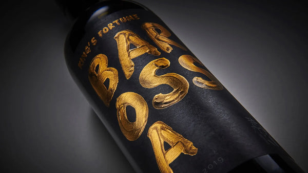
Consider Cultural Sensitivities
Businesses across North America rarely dedicate their product to only one cultural/racial group. They almost always sell products to multicultural markets. Because of that, always consider cultural sensitivities before choosing the packaging typography. Some fonts have a strong meaning for certain groups of people. On the other hand, some of them may even be offensive and lead to misunderstandings. A lot of research will be necessary here!
![]()
Credits: Agata Chmielewska
Be Mindful of Accessibility
The number one rule regarding typography packaging design is - accessibility should never be compromised. Entrepreneurs must ensure that the fonts they use are readable for absolutely every potential buyer. That task especially matters to those consumers with visual impairments. To ensure the highest readability score, you can use larger fonts and fonts with high contrast for printed materials, etc.
Credits: The Spice Agency
Create an Emotional Connection
Thanks to all the benefits of packaging typography; entrepreneurs can evoke the emotions of consumers! Yet, which emotional impact you want to trigger depends on your goals. Don’t hesitate to experiment with things. Try different fonts appropriate for feelings like comfort, nostalgia, or excitement.

Credits: James Yarema
Opt for Responsive Typography
People selling products online must not forget that their packaging will appear on the screens of thousands of people. That’s why we strongly recommend each entrepreneur opt for responsive typography. It must be flexible and look appealing on print and screens at the same time. Spend more time checking your overall packaging design on different smartphones, laptops, and tablets.

Credits: Herman-Scheer
Maintain Visual Balance
The balance between packaging typography and other design elements must exist! The overall harmony of the packaging will get lost if you focus too much on textual content (or the other way around).

Credits: Alexandra Necula, Zany&Shy
Incorporate Iconography
Complementing typography to make the messages visually appealing is possible by adding different icons on the packaging. In this case, you don’t have to look for solutions often. Adding a small icon next to a benefit or instruction will be enough.

Align with Target Demographics
Most professional businesses would invest time, money and energy to understand the common characteristics of their target audience. Unfortunately, they usually do that for social media ads, email marketing and similar promotional tools. The same strategy will be necessary for typography packaging designs. Understand what your buyers prefer and excerpt. For instance, younger buyers will expect modern fonts, while older people are bigger fans of classic typography.

Credits: Mauro Gigli
Test Before Finalizing
Last but not least tip we have is to do all the necessary tests before finalizing the process. Sometimes, it will be necessary to ask your buyers for feedback directly. Also, you can analyze the reviews left on your website or other platforms. If you notice that most comments are either negative or neutral, you haven’t triggered the emotions you wanted. Check out the gaps you made and try to fix them with new creative ideas.
Typography in Various Packaging Types
Choosing adequate packaging typography also depends on your packaging types and accessories. There are three of them that can ensure you a unique approach to typography, and they are:
• Custom boxes and cartons
• Custom stickers and labels
As you can guess, each one comes with different requirements and rules. That’s why we would want to analyze them.
Custom Boxes and Cartons
Customized cartons and boxes are ideal for testing various typography options. Using large, bold fonts is recommended, especially for primary and secondary information. There will be enough space to add more details about benefits and features. Also, you will have enough space to add the company’s slogan or short message.
If you like the idea of a hierarchy in design, we strongly recommend you use customized boxes and cartons. Arka can help you find perfect solutions and help you turn all your packaging typography ideas into reality.
At Arka, we offer custom packaging options for any niche! Check out our custom mailer boxes or shipping boxes and contact us to create your perfect package today!

Custom Stickers and Labels
Labels and custom stickers have quite the opposite requests. They are small, which requires highly legible fonts. They must remain clear even if you put them on reduced dimensions. Just like in the previous case, highlight the main information like brand/product name and slogan on these two marketing tools. Your packages can easily be recognizable because of that, which ensures improved brand identity.

Flexible Packaging
Undoubtedly, the biggest challenge would be to pick typography for sachets, pouches and similar packages. You will need to find fonts that remain legible and adapt easily to these packaging types. Yet, keep in mind that, in this case, textual content should not be too long. You can easily harm the overall look of the packaging that way.
Packaging Typography Trends to Consider
It is crucial to make the difference between copy/pasting typography ideas and following the latest trends. Typography trends evolve together with the packaging industry. It is essential to check out what your competitors offer and adapt the requests of the market to your needs. Here are some of the trends you should have in mind!
Minimalistic Packaging Typography
You have probably heard the phrase “less is more” in the business world. This is the principle of a minimalistic idea! Whichever packaging typography you decide on, strive to keep the simplicity. That means all the fonts you use should be straightforward and clean. Highlight the main things that can make your packaging look more elegant and sophisticated. Minimalist packaging design can boost your brand and add an elegant touch.
Handwritten and Custom Fonts
Each packaging should be personalized in some way. A handwritten message from the CEO can be a good idea. The human connection will make them feel like they got a personalized product that will convince them to return to you. Yet, remember that this type of trend is only good for brands emphasizing individuality and craftsmanship.
Vintage and Retro Typography
Retro can sometimes be modern! Some people are nostalgic and are happy to see typography used many years ago. If your target audience supports classic elegance, this trend may be a perfect choice for your business.
Experimental Typography
Breaking the rules is sometimes okay! Yet, if you decide to do that, you must be careful. Using experimental packaging typography is risky but can help your brand stand out from the mass of other businesses. It can be a great choice for businesses that connect people willing to connect with something unusual and completely new.
Examples of Brands with Amazing Packaging Typography
Some brands have greatly boosted their sales and brand identity with significant typography changes. How they did it may give you an idea of how things should be done in your case. Read more about some of them!
McDonald’s
Packaging designers hired at McDonald’s seem to know how to nail it with typography ideas. First of all, all of their packages come with flat illustrations. Each illustration represents a different product. Yet, regarding typography, they haven’t made any bigger changes. Their packages have rounded modern letters, which makes each product eye-pleasing. The well-known logo has stayed on each package.

Credits: Pearlfisher
Burger King
The retro approach that Burger King supports regarding typography and packaging design is amazing! The typography they use now is the same as the one they used during the 60s and 70s. Also, they used different letter sizes for different packages, but their design remained the same.

Credits: epda-design.com
Nuud
For those who do not know, Nuud is a brand that sells biodegradable chewing gums. Their packaging typography is fantastic. The main focus is on the brand’s name that looks like a smile! Also, a small message, “Chew plants, not plastic,” is located immediately above the logo. That way, they managed to highlight their products' main benefits/features.

Credits: Mother Design, Nuud
Final Thoughts
We are glad you finally got the chance to learn everything about packaging typography. Each tip we shared is adequate for a different type of entrepreneur. Put into consideration other design elements, the size of the packaging, and the requirements of your target audience. That way, it will be much easier to pick the adequate packaging typography packaging design. Follow the latest trends and analyze the changes most successful brands have made.
FAQs on Packaging Typography
What are some color combinations that work well in packaging typography?
It depends on what type of goal you want to achieve. The good news is that there are many options in front of you. You can use contrasting colors like black text/white background or analogous colors like blue/blue-green/blue, and so on.
Should I prioritize readability over aesthetics in packaging typography?
YES! Readability must be the main priority and the base for all entrepreneurs looking for the best typography solutions.
Can I use multiple fonts in my packaging typography?
The short answer is: it depends. Sometimes, using different fonts and highlighting various information differently is recommended. For instance, primary and secondary information should be written with “stronger” fonts. Yet, don’t overdo it! Limit the variety of fonts and use only 2 or 3 of them without harming the overall packaging design.